Background
The 2026 Calendar Design project for Panca Kraft Pratama (PKP) was created to be more than a functional calendar. As a craft paper factory which recycle used cardboard boxes, PKP wants to highlight their product to be used as their main material.
Challenge
The main challenge lay in the use of craft paper as the printing material, which naturally reduced color contrast and overall visibility, especially when paired with traditional photo-based visuals. This limitation risked making the calendar less impactful and difficult to appreciate in everyday use.
Solution
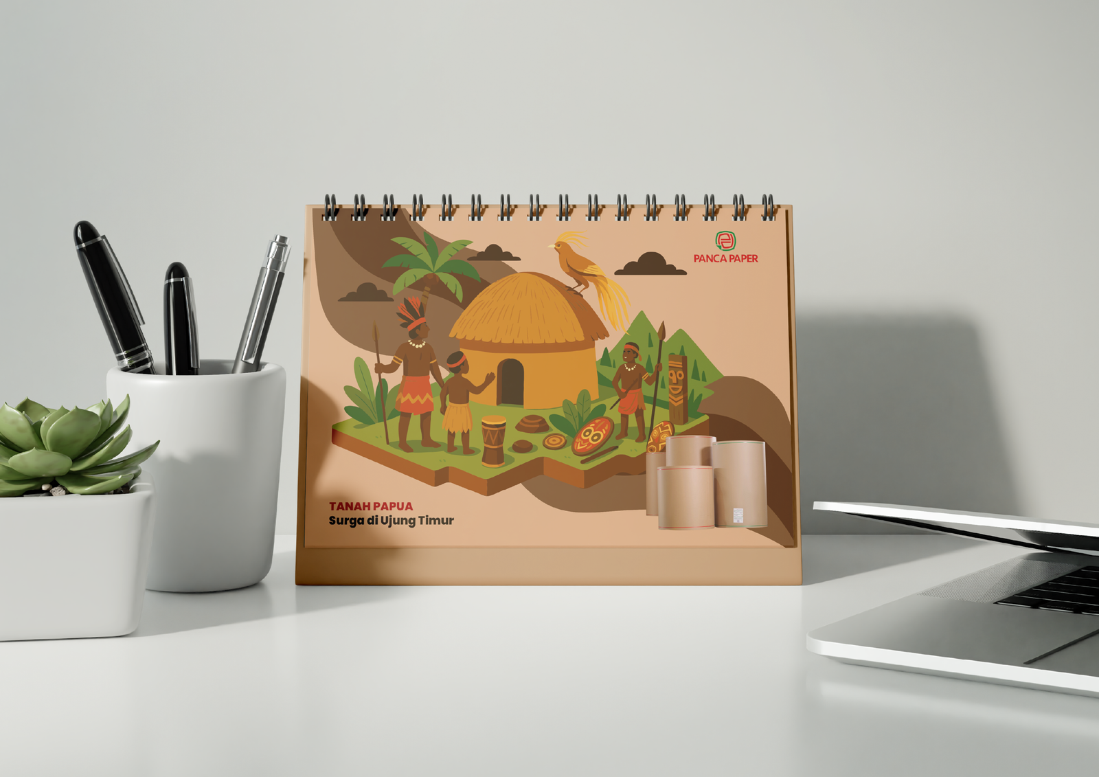
To overcome this, we elevated from a standard photo-based layout to a fully illustration-based approach. By using stylized illustrations with controlled color palettes and clear visual hierarchies to enhance the visual clarity, strengthened storytelling, and transformed the calendar into an engaging and cohesive design piece.